I’d like to share the evolution of the design for Trilobyte 16. The path that I and the design followed is in many ways typical, often landing one far from the original conception.
My partner, Anke, and I had been thinking of the kind of boat that could be quickly built in a corner along the shores of Lago Maggiore, Italy, where Anke’s Mother lives. Our visits last up to a couple of months, during which we have a lot of free time to explore the region. The lake is about xxx miles long with it’s windy head at the base of impressive Swiss Alps, its long middle in the Italian foothills and the south end flattening toward the plains of Milano.
Being densely settled and, our Italian being piu bruto (I think it means ‘abominable’), we’d need to be able to sleep and cook aboard in all weathers and warm ourselves over winter visits. An outboard should be mountable, but bureaucratic hassles and our own predilections make oars preferable.
Three principles to guide us as our design ‘evolves’:
-
K.I.S.S. (Keep It Simple, Stupid)
-
Employ Appropriate Technologies (available, affordable, workable)
-
Maximize Synergy (the ‘sum is greater than its parts’ effect)
These three often work together, but are as often at odds. We might, for example, complicate the design slightly for a dramatic increase in synergy. Together they churn out a result which is usually highly adapted to its proposed environment. Oddly enough, an aesthetic beauty, albeit unaccustomed, is inevitable.
So... it all begins in your head. Don’t rush this phase, as your mind, one of the most powerful computers the universe has produced, is working magic here. Give yourself time to mull it over and over. Try not to control the process, but give it uncensored reign. Let foolish fantasies go undisciplined, crazy influences have their way, the ‘small stuff’ go unsweated (that all comes later!)... you’re brainstorming. Your mind will slowly crystallize into the seed of your design.
Next comes the doodle. Pencil, eraser, paper, eraser, more paper, etc. At this point, you’re looking to capture that vague image in your head... the spirit of your concept incarnated in a form. In the case of Trilobyte, the first doodle was a lentiform, crab-clawed Birdwatcher-style sharpie (the Birdwatcher concept is Phil Bolger’s brilliant innovation of see-through, water-tight topsides).

| Here’s a hint: when drawing a curve freehand, position the paper so that your wrist and elbow are at right angles to the curve on the concave side.
And another: to help scale your doodle, first draw some freehand squares. For example, four 4ft x 4ft squares drawn in a row with common fore and aft edges gives you a 4ft by 16ft drawing frame. Further subdivisions of the vertical and horizontal help position important components. To place a waterline at six inches, say, divide the vertical square into fourths for one foot marks, and the lower one by two for a half a foot (6 inches). |
Now the debugging and problem solving begins.
What’s working? Two ply sheet length by one width provide good accomodations, and 6in draft gives reasonable displacement for crew and gear. The flat cut sail is simplicity itself. The ‘automatic rig’(handled remotely via running lines), synergizes beautifully with the Birdwatcher concept. The inboard rudder likewise keeps all underway handling below-decks. I’m excited by the ‘spray skirt’ coamings with an anorak sewn into the fabric cover for rainy day, stand-up sailing.
What’s not working?? That sharpie rocker looks like a backache on ‘the morning after’. Inboard rudders on curved bottoms develop weed-catching gaposis when turned. I’m worried about visibility fore and aft (the sides are clear, but what about the decks? There must be five control lines for that rig (two sheets, two limb down-hauls and a tack down haul)... not so KISS.
Debugging usually follows a spiral path, covering and re-covering each problem. Aha!s come and go as each solution is fit and adapted to other solutions. Some (even many) are dead-ends, petering out from their own inadequacies, or being nixed by higher priority solutions already in place. This phase is another that takes time, often in the wee hours of the night.
Let’s take a look at Trilobyte’s progress as of the 2000 Duckworks Design Contest:

(click image for larger view)
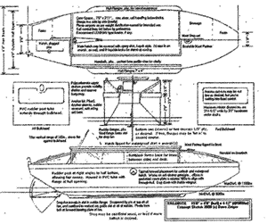
The ‘doodle’ has reached the ‘concept sketch’ stage. Dimensions have been firmed up with materials in mind. Components are more precisely placed, initial calculations made. Problems have been addressed by a few spiraled passes (note the upturned aft bottom with right-angle rudder post... stays tight to hull through the turn). The sharpie hull has become a barge hull through an Aha! Influences from others have been incorporated. Phil Bolger’s ‘advanced sharpie’ concept (matching curvature in plan (from above) and profile (from the side) view) is applied to make an ‘advanced barge’. Matt Layden’s ‘hull flanges’ (or ‘chine runners’) provide lateral resistance with no handling or extra draft. The ‘salt shaker’ oar port closure is a stab at making them watertight with a closure that stays in place when open.
'Chine runners' are wing-like extensions running along the chine, which serve to increase the efficiency of the lateral plane. In Trilobyte, they also guide the physical alignment of the hull side panels and bottom, thus allowing building on ground that is neither true nor dead-level.
Matt Layden uses them on his li'l cruisers, which can be seen at
https://home.triad.rr.com/lcruise/pictures.htm
But problems remain. The fan rudder is not KISS (and unnecessary, as it turns out). Fore and aft visibility are still problems, though triangular offcuts from the window panels will allow deck windows. The bow and stern compound curves (both in plan and profile view) call for advanced carpentry or multiple construction techniques (e.g., chine construction for the upper and mid hull and tack ‘n tape at lower bow and stern). There’s something disturbing me about the bulkheads, which are 3'11½" wide... an ugly number. The rather abrupt turns at the ends may require thwartships kerfing of chines and bottom, an advanced technique. Standard lumber dimensions aren’t quite right for those chines. And that 36" headroom... almost, but not quite.
Aha! Make that ugly number disappear by running the hull planking outside the bottom planking and both bulkheads are now a full and even four feet wide. No layout or cutting there! But Aha! If you do that at the transoms, that simplifies the ends and further reduces layout and cutting. Hmm... but visibility gets worse at the ends. Aha! If we make the sides 3'6", break the decks fore and aft, and use the window offcuts thwartships, that solves headroom, visibility and upper hull complexity. But not very sexy. But Aha! That excess material could be used to cant the decks, restoring her good looks, shedding water and increasing stowage, access and tiller utility. A sharp ‘knuckle’ at the aft bottom simplifies construction and provides the key alignment point for the whole boat... after that Wow! The hull self-rectifies!! Synergy City!
But, to my surprise, that ‘saucer’ shape that so tickled my fancy is gone. It became the kind of dead end which is like blinders on a horse, keeping me from considering alternatives. While all the initial objectives remain, ‘ease of building’ grew to be the dominant consideration. Finally, a cabin cruiser emerged which can be built ‘on location’ in radically short time (we estimate three 12 hour days for a couple), and under widely ranging circumstances.
Lets look at her now:

We’re now spiraling to the actual plan stage. Materials sheets are made up, calculations finalized and details filled in to the point that a prototype can be built. Problems have fallen like dominoes and improvements have slowed to a standstill. You can visualize every step of the building process, and no worrisome corners are left.
So why actually build a prototype? Because virtual solutions have unexpected real world consequences. In our case, our oar ports didn’t work well, glue was hard to clean out of the numerous corners of the bulkheads, the ‘spray skirt’ fabric cover on the lipped coamings was a bust, etc. Invaluably, we were able to play with the full sized rig. Those five control lines were reduced to three. Yard placement, the quick and dirty U-joint and limb joints were improved. Chine runners didn’t work as we’d hoped on the barge hull (they have to be deep to work well, and the barge floats high) so an off-centerboard was added. The forward bottom curve was allowed to run at the bow, easing installation. Building orders were improved, glues exchanged, techniques altered. Experience gained in the prototype prepares us for the final phase.
Having spiraled dizzily along with me, we come to the ‘finalized’ plans... the ones to be released into the world at large. Presumably, all design problems have been solved to satisfaction. You’re now ready to move on to the much more manageable, though finicky area of presentation. Any design has a lot of information associated with it which must be clearly communicated to the builders. Approach and level of detail will vary with your audience.
Fortunately, there are any number of fine examples. Collected designs of Phil Bolger, Jay Benford, William Garden and Paul Gartside are but a few of the excellent draftsmen available as paper mentors. You’ll develop your own style and hone your skills in short order.
At some point, I recommend making the transition to CAD (Computer Assisted Design). Early design was done with a block of wood and a penknife, then moved on to paper, pencil, splines (or curves) and architect’s rules. These work extremely well. Their downside is that each draft is a major investment of your time. There is a tendency to ‘leave well enough alone’ when some ‘Aha!’ would scrap a drawing that’s taken hours of work. Passing up the improvement not only impoverishes your design, but may keep you off the rung which lets you see ‘over the wall’. CAD isn’t immune, but each draft tends to extend its predecessors, enhancing the upward spiral of ideas. In addition, CAD designs inhabit that heady Grecian plane where Pythagoreans scribe perfect figures whose lines join at infintesimal points. In scaled drawings, the thickness of a pencil line and your eyesight at the rule condemn you to the common plight of mortals.
For those of us who must mess about in boats, their design and details are a source of endless delight. We while away our days and nights dreaming boats anyway... why not pull out that pencil and paper. That was easy. How about a scale rule? Still easy. Build what you’ve dreamed? What’s stopping you?

(click to enlarge)
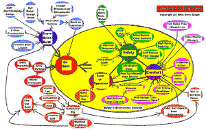
Such charts can help pinpoint ‘rogue’ components or unmet needs.
See https://www.triloboats.com/ for more info or to buy plans |

